DLF Avenue: Mall branding
DLF Avenue is a bit different from the average Indian mall. The idea was for it to occupy a space that’s closer to a town square than a shopping mall, very much a part of the community and informed by culture at large.
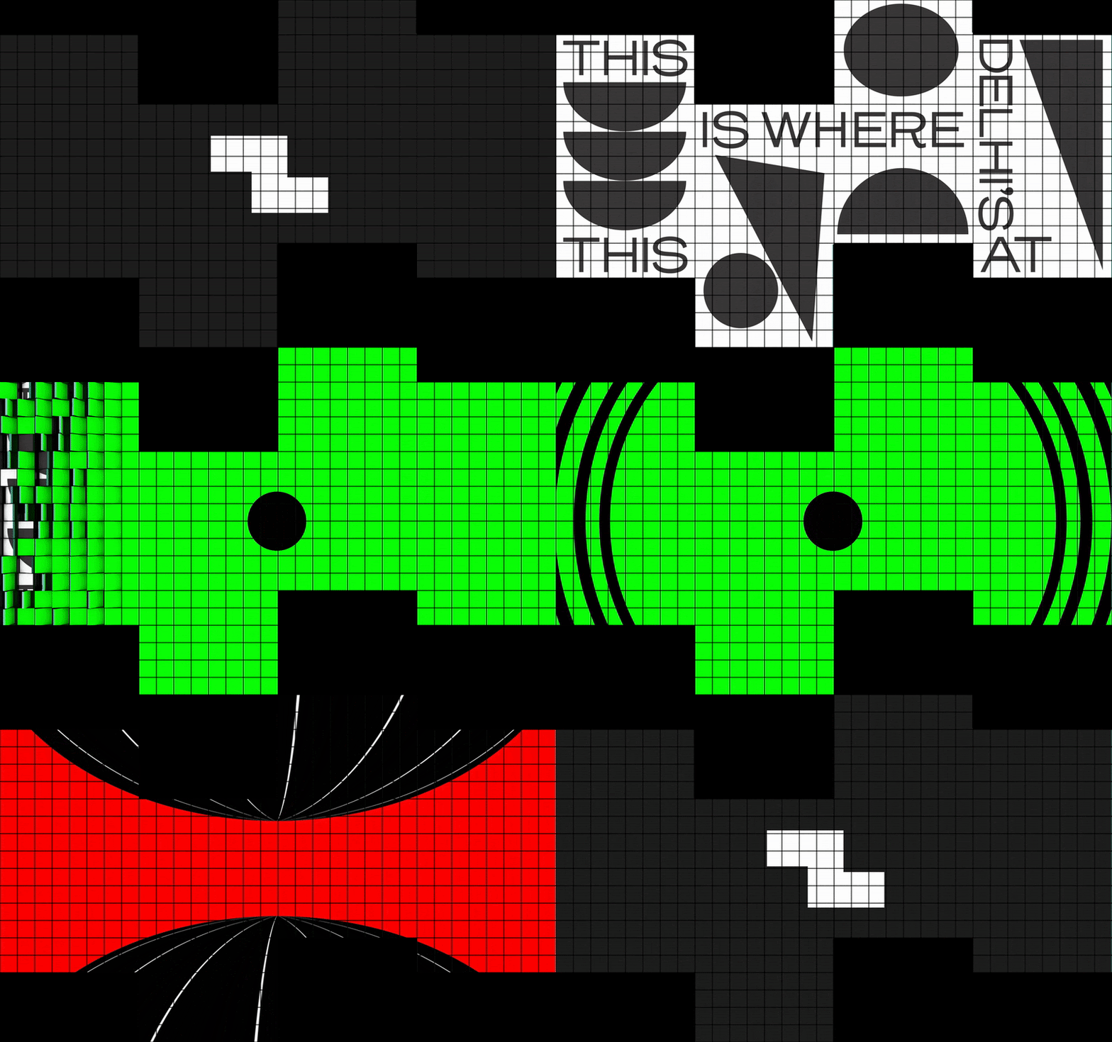
For its identity, we took inspiration from the space itself - the architecture of DLF Avenue forms a strange Z that we turned into an instantly recognisable icon. It was the starting point for a rather extensive design system and everything from signages to collaborations with local artists and designers.
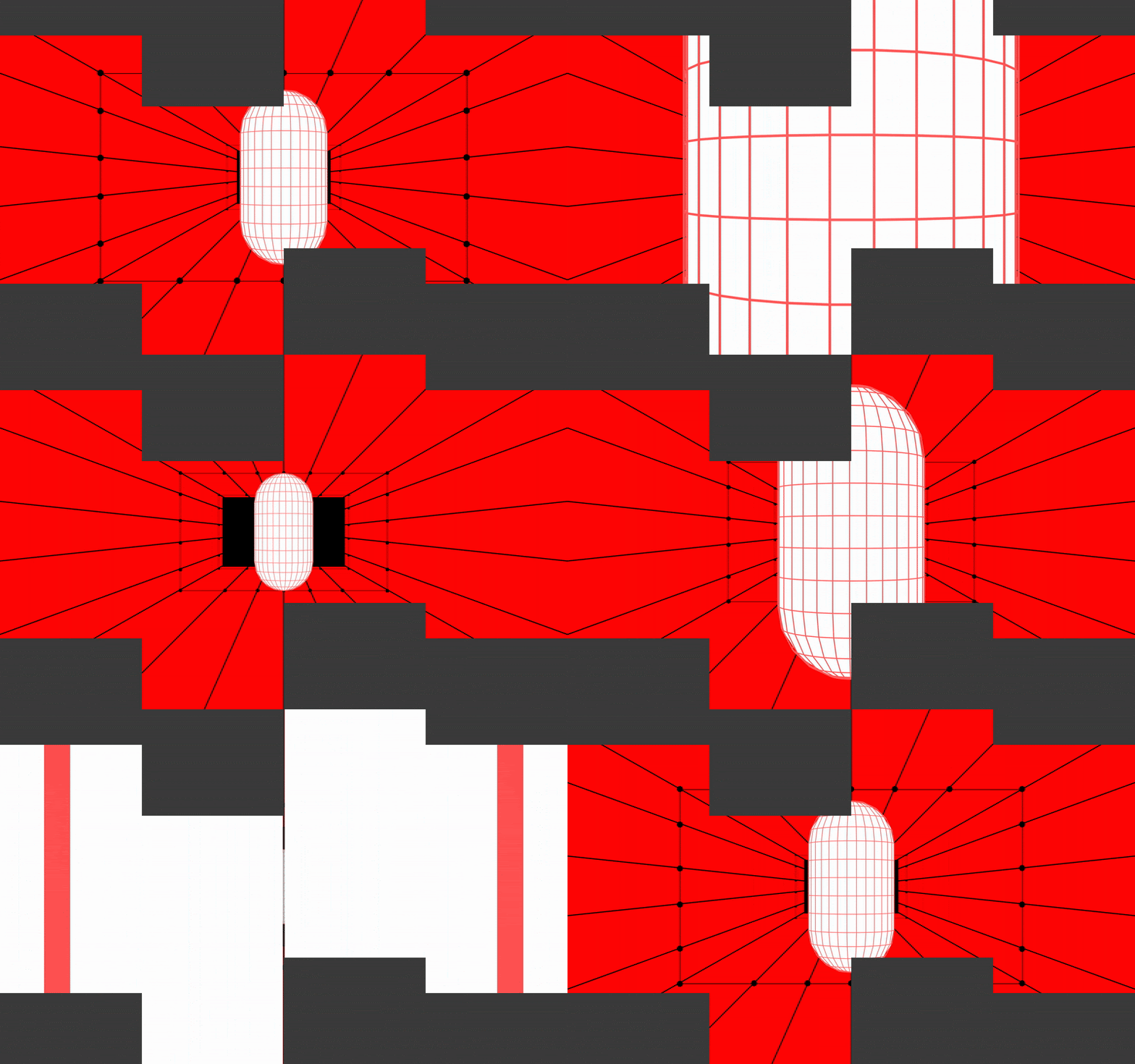
The design system lends to a flexible framework than a rigid set of guidelines. For instance, DLF Avenue doesn’t have a colour palette per se - because how do you pick a colour for a brand that houses hundreds of brands? That’s why we picked neutral tones of black and white, with pops of fluorescence. Put simply, this system sets the tone and visual language for all things DLF Avenue.


